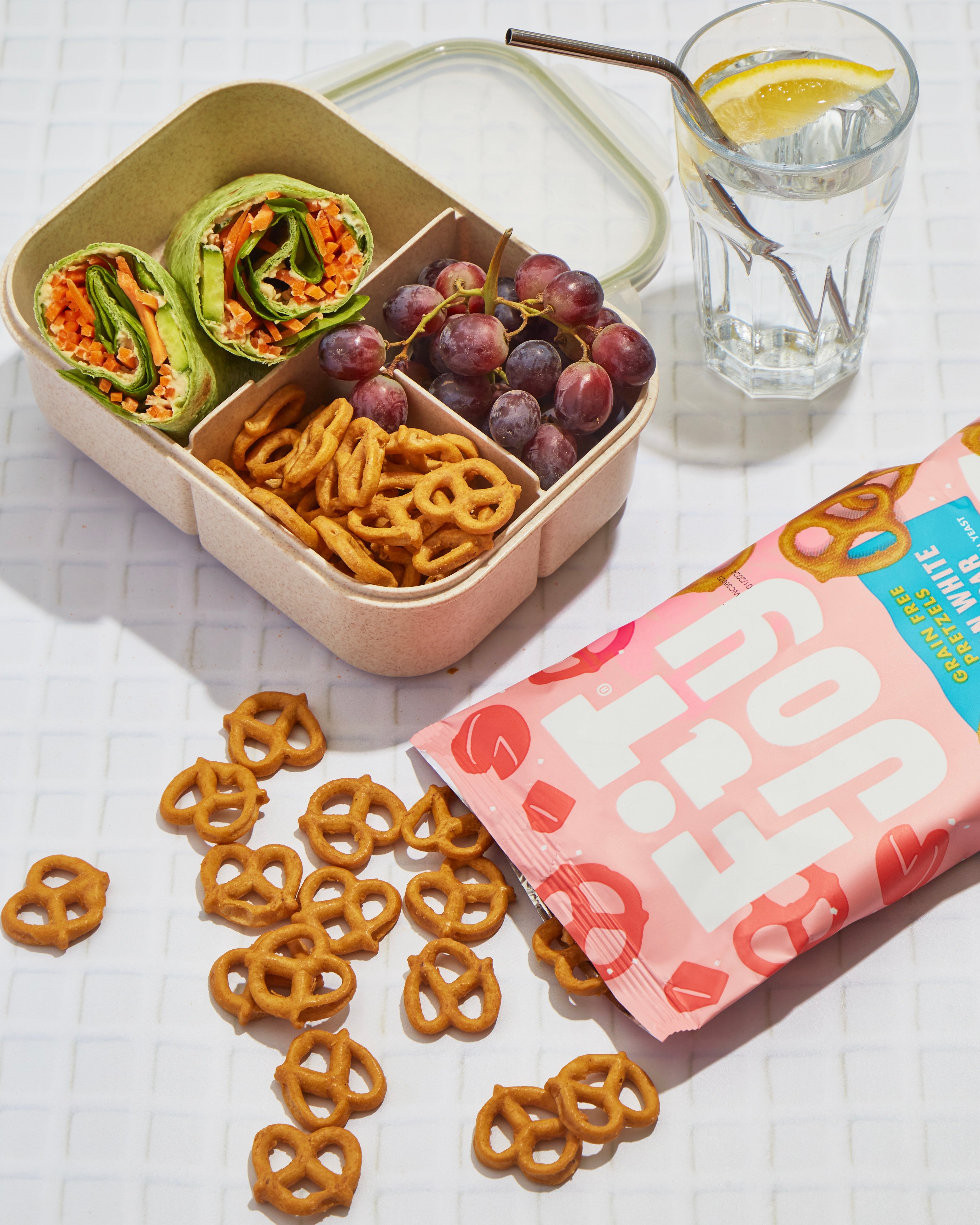
News Snack Goals: FitJoy’s Cheezy White Cheddar Pretzels Just Got the POOSH Stamp of Approval July 07 • 2025
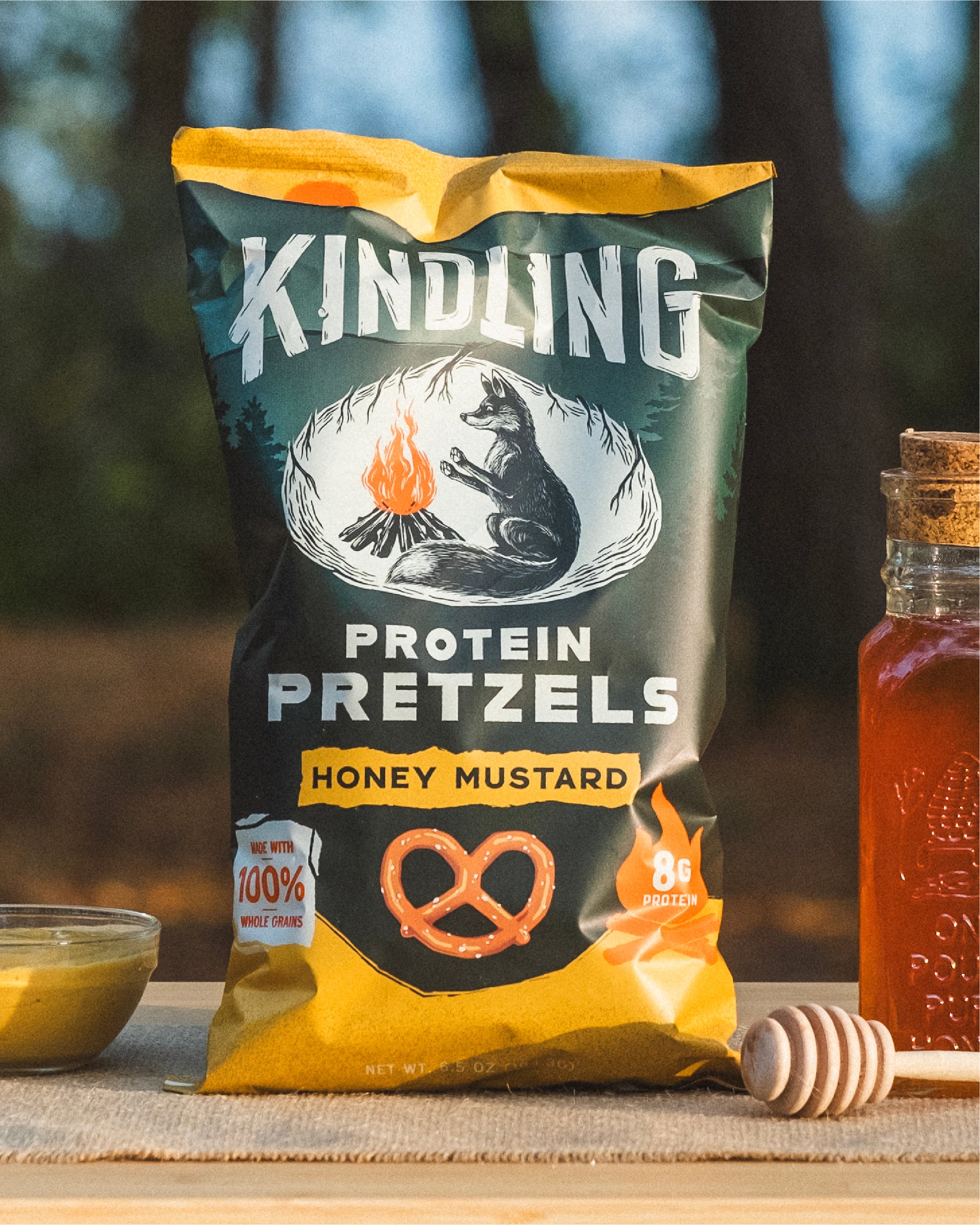
News Kindling Snacks Earns a Spot on Men’s Health’s List of “The 15 Best High-Protein Packaged Products” May 27 • 2025
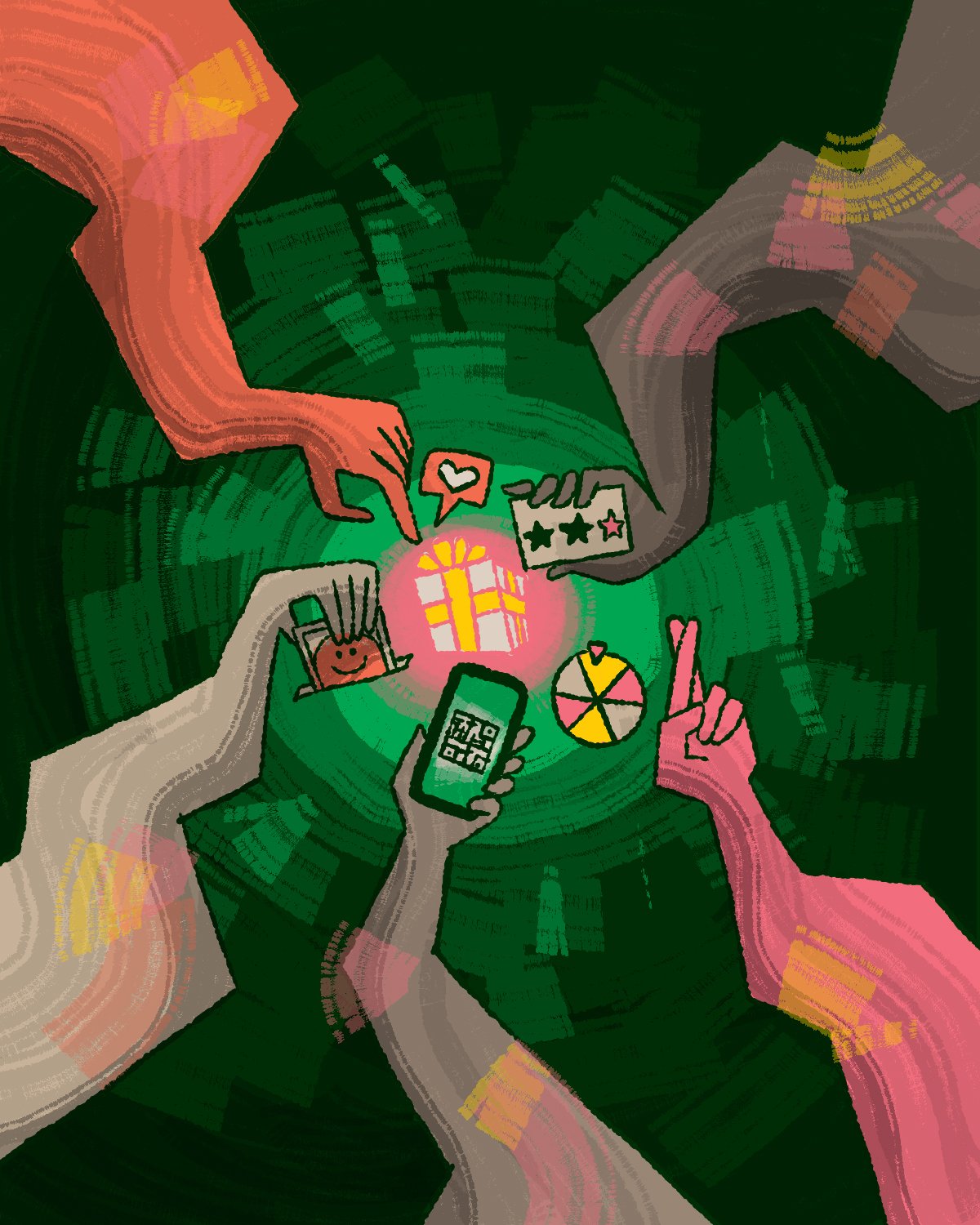
5 Types of Giveaways Every CPG Brand Should Try (And When to Use Them) Author Melinda Lathrop Date July 9 • 2025 Ideas Author Melinda Lathrop Date July 9 • 2025 Ideas
Snack Goals FitJoy’s Cheezy White Cheddar Pretzels Just Got the POOSH Stamp of Approval Author Moxie Sozo Date July 7 • 2025 News Author Moxie Sozo Date July 7 • 2025 News
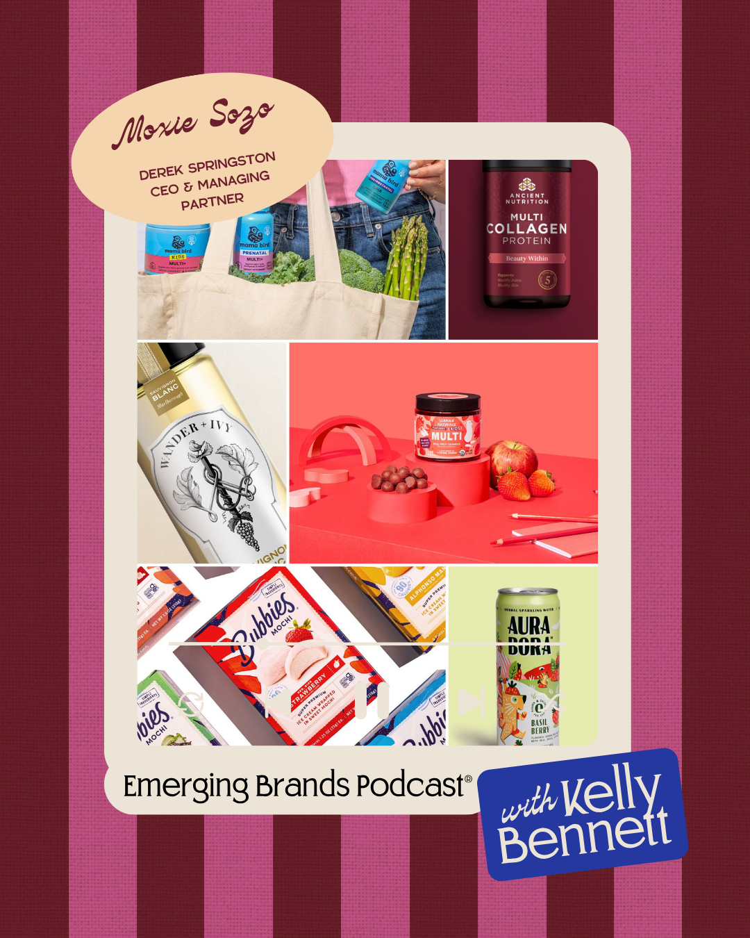
Podcast Emerging Brands with Kelley Bennett x Derek Springston Author Moxie Sozo Date July 3 • 2025 News Author Moxie Sozo Date July 3 • 2025 News
The Brands That Last Know Something You Can't Measure Author Matt McMullen Date June 25 • 2025 Ideas Author Matt McMullen Date June 25 • 2025 Ideas
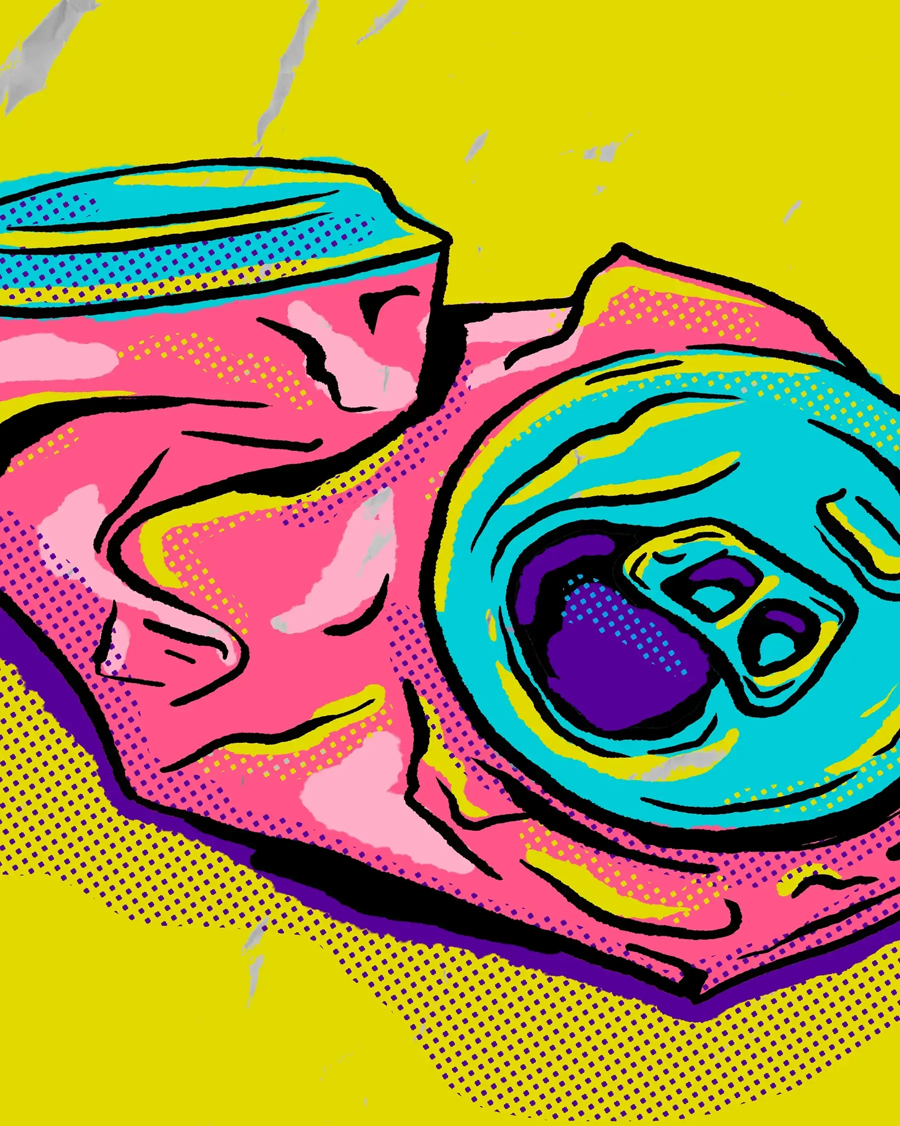
Beautiful Garbage Musings of a Packaging Designer Author Nate Dyer Date June 12 • 2025 Ideas Author Nate Dyer Date June 12 • 2025 Ideas
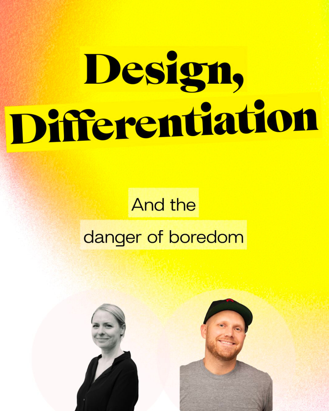
Podcast TomorrowBrands — Design, Differentiation, and the Danger of Boredom Author Moxie Sozo Date June 6 • 2025 News Author Moxie Sozo Date June 6 • 2025 News
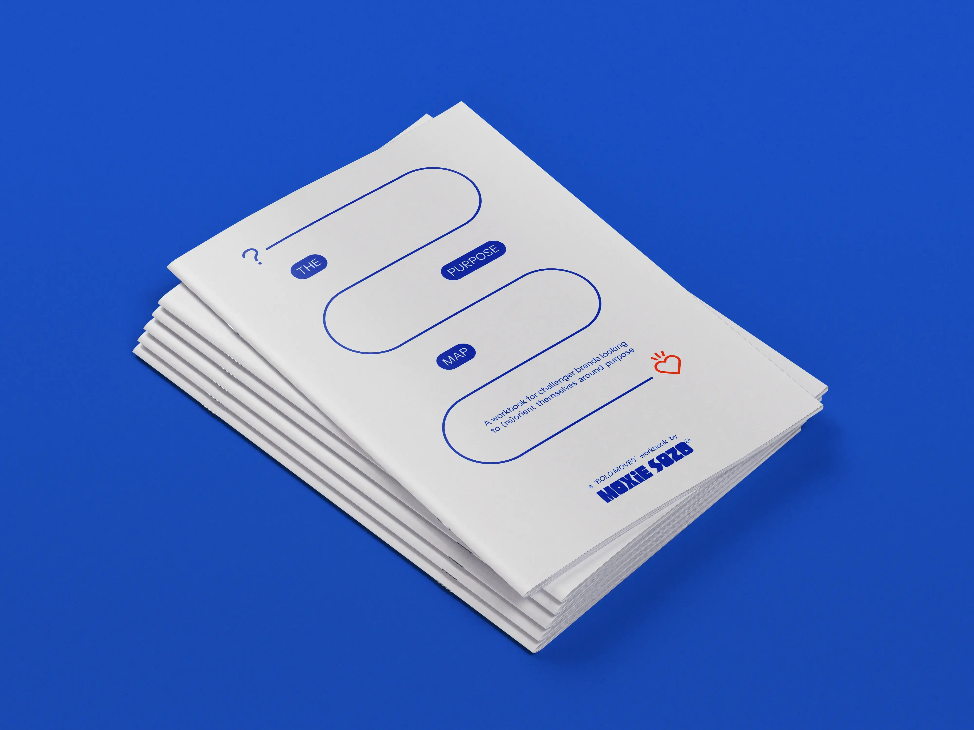
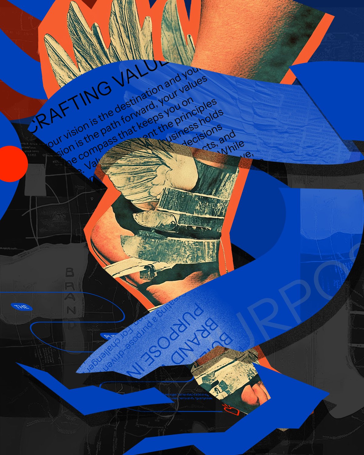
Moxie Sozo Downloadable Purpose Map Author Moxie Sozo Date June 2 • 2025 Ideas Author Moxie Sozo Date June 2 • 2025 Ideas
When Purpose Meets Performance Metrics Author Lindsay Connors Date May 28 • 2025 Ideas Author Lindsay Connors Date May 28 • 2025 Ideas
Kindling Snacks Earns a Spot on Men’s Health’s List of “The 15 Best High-Protein Packaged Products” Author Moxie Sozo Date May 27 • 2025 News Author Moxie Sozo Date May 27 • 2025 News
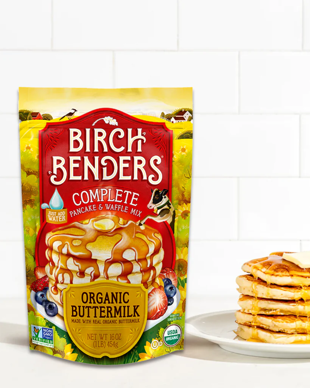
Yahoo! Names Birch Benders One of the Best Pancake Mixes of 2025 Author Moxie Sozo Date May 19 • 2025 News Author Moxie Sozo Date May 19 • 2025 News
Confessions of an Accidental Salesperson Author Lisa Wolf Date May 14 • 2025 Ideas Author Lisa Wolf Date May 14 • 2025 Ideas