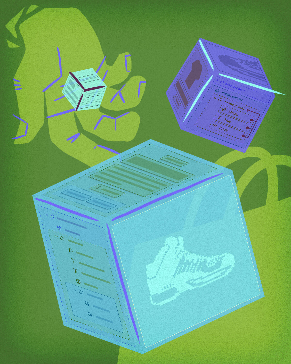
As any Shopify developer knows, the platform never sits still. Shopify is always adding new and exciting features that benefit both developers and store owners. One of the big ones announced in early 2024 and rolled out in 2025 is Theme Blocks.
Theme blocks let developers build layouts with smaller, reusable bits of code. Think of them as snippets, but with their own customizable input settings. Before this, we only had section blocks: useful for adding blocks into sections, but pretty limited. You couldn't nest blocks inside other blocks. Theme blocks fix that.
If you're like me, you probably thought: "Wow, this is amazing! This will simplify the dev experience SO much." And it can... But it's still in the early stages, and has some downsides.
Quick tip for our readers: want to start using this info right away? If you've got a dev team, make sure they're clued in on the latest Shopify updates. No team? No problem, keep this blog handy and chip away at staying current. And when you're ready for bigger updates, Moxie Sozo has your back for all things website and development.
The Cons of Theme Blocks
1. You can't mix section blocks with theme blocks
If your section is already using section blocks, you're out of luck. Theme blocks and section blocks don't play nicely together.
2. Passing variables around can be painful (or impossible)
Theme blocks can either be static or dynamic. Static blocks work kind of like snippets with customizable settings. You can pass variables into them pretty easily. Dynamic theme blocks? Nope. No passing variables. There are workarounds (we'll get into those later), but they're clunky.
3. No block limits (yet)
Section blocks have the handy "limit" prop in their schema to restrict how many of a certain block type can be added. Theme blocks don't. Maybe Shopify will add it eventually, but as of now, you can't technically limit the number of theme blocks someone can add.
So Why Use Theme Blocks Anyway?
Despite those drawbacks, there are some big upsides to using theme blocks:
More flexibility with nesting
Being able to put theme blocks inside sections and other theme blocks opens up all kinds of structures. For example, you can create a card block that store owners can assemble like Lego pieces—mixing text, buttons, and images however they'd like.
Less duplicated code
Theme blocks are global. You can drop a "Text" block or a "Spacing" block anywhere in your theme instead of duplicating schema code across multiple sections. Less copy-paste, and less maintenance headache.
Customizable snippets
Static blocks are basically snippets with settings. If you've ever wanted a reusable chunk of code that store owners can tweak, this is it.
The @split Pattern
As we explored Shopify's newer block-based themes, we discovered one particularly clever approach. We're calling it the @split pattern.
At its core, the @split pattern means:
- Capture the output of one or more theme blocks.
- Insert <!--@split--> in the markup where you want to divide things.
- Split the captured output into an array using Liquid's split filter.
- Iterate over those chunks however you want.
This lets you wrap deeply nested blocks differently depending on context, or selectively output just part of a block.
Building a Card Grid and Card Slider
Let's say you have a Card Grid section. Inside it is a Card Group block, and inside that are a bunch of Card blocks (each with their own content blocks).
Now imagine you want to reuse that Card Group inside a Card Slider section. The only catch: the slider requires wrapping each card in different markup than the grid. Instead of duplicating everything, you can use <!--@split--> to break the output into an array and rewrap it.
Theme folder structure
theme/
  blocks/
    card.liquid
    _card-group.liquid
  sections/
    card-grid.liquid
    card-slider.liquid
_card-group.liquid
{% content_for 'blocks' %}

{% schema %}
  {
    "name": "Card Group",
    "tag": null,
    "blocks": [
      { "type": "card" }
    ],
    "presets": [
      {
        "name": "Card Group",
        "category": "Content"
      }
    ]
  }
{% endschema %}
This grouping block just holds Card blocks.
card.liquid
<div class="card" {{ block.shopify_attributes }}>
  {% content_for 'blocks' %}
</div><!--@split-->

{% schema %}
  {
    "name": "Card",
    "tag": null,
    "settings": [
      ...
    ],
    "blocks": [
      {
        "type": "@theme"
      },
      {
        "type": "@app"
      }
    ]
  }
{% endschema %}
The key here is <!--@split-->. Every card outputs that comment, so we can later split the block output into an array.
card-slider.liquid
...

{%- capture cards -%}
  {% content_for 'block', type:'_card-group', id:'static-card-group' %}
{%- endcapture -%}

{%- assign card_list = cards | strip | split: '<!--@split-->' -%}
<div class="swiper">
  <div class="swiper-wrapper">
    {%- for card in card_list -%}
      <div class="swiper-slide">
        {{ card }}
      </div>
    {%- endfor -%}
  </div>
</div>


...
And voilà! We've wrapped each card in some custom HTML depending on our current needs.
Adding Thumbnails to the Slider
Now let's push it further. Say your slider also needs a thumbnail strip. We want to use the same card group and cards for this, though. You would think passing a variable into the Card block to tell it which version to render would be the way to go… except, remember, dynamic blocks can't accept variables.
So again, we use <!--@split-->.
In card.liquid, add two outputs separated by split markers:
<div class="card" {{ block.shopify_attributes }}>
  {% content_for 'blocks' %}
</div>
<!--@split-->
  <div class="thumbnail" {{ block.shopify_attributes }}>
    {{ block.settings.image | image_url: width: 768 | image_tag }}
    </div>
  <!--@split-->

{% schema %}
  {
    "name": "Card",
    "tag": null,
    "settings": [
      {
        "type": "image_picker",
        "id": "image",
        "label": "Thumbnail Image"
      }
    ],
    "blocks": [
      {
        "type":
        "@theme"
      },
      {
        "type":
        "@app"
      }
    ]
  }
{% endschema %}
Now you've got both the full card and the thumbnail baked into the same card block.
_card-group.liquid
{%- capture children -%}
  {%- content_for 'blocks' -%}
{%- endcapture -%}

{%- assign children = children | strip | split: '<!--@split-->' -%}
{%- for block_content in children -%}
  {%- assign mod = forloop.index0 | modulo: 2 -%}
  {%- if mod == 0 and thumbnails != true -%}
    {{ block_content }}
    <!--@split-->
  {%- elsif mod == 1 and thumbnails == true -%}
    {{ block_content }}
    <!--@split-->
  {%- endif -%}
{%- endfor -%}

...
This version of the Card Group block takes whatever's inside it, splits it up at each <!--@split-->, and then decides what to output based on whether the thumbnails variable is set.
- If thumbnails is true, it outputs the thumbnail version.
- If not, it outputs the main card content.
- The modulo (% 2) just helps alternate between "content" and "thumbnail" chunks.
Notice we're also re-adding <!--@split--> inside the loop. That way, when this output bubbles up to the Card Slider section, we can split again into arrays of slides and thumbnails.
card-slider.liquid
{%- capture slides -%}
  {% content_for 'block', type:'_slide-group', id:'static-slide-group' %}
{%- endcapture -%}

{%- capture thumbnails -%}
  {% content_for 'block', type:'_slide-group', id:'static-slide-group', thumbnails:true %}
{%- endcapture -%}

{% assign slide_list = slides | strip | split: '<!--@split-->' %}
{% assign thumbnail_list = thumbnails | strip | split: '<!--@split-->' %}

...
Here we capture the same Slide Group block twice:
- Once for the full slides.
- Once with thumbnails:true to grab the thumbnail outputs.
Then we split both captures into arrays, giving us two lists we can render however we want. One for the main slider, one for the thumbnail strip.
Wrapping Up
The @split pattern feels a little hacky, but it works. And honestly, theme blocks are still quite new. They're powerful, but limited—and patterns like this let us stretch them further than Shopify maybe intended.
If you're building with theme blocks in 2025, expect to do some creative thinking. But the good news? You can build flexible, fully block-based themes today, and the tooling will only get better. Hopefully, by the time Shopify smooths out these limitations, we'll already have the patterns to make the most of them.
Need some custom Shopify development? Contact Moxie Sozo for any of your development needs!
%20(2).png)