CPG, IRL: The Importance of Analog Practices in Packaging Research and Design
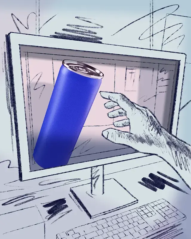
“Have you tried printing that yet?”
It's an oft-uttered phrase around Moxie Sozo because we know that if, at any point, a design will be physically produced, viewing and experiencing it outside of digital confines has undeniable value. You'd better believe we're big fans of rigorous testing, but long before the sample panel sees a concept digitally, we see it clearly in real life—the earlier, the better. And the advantages are far-reaching.
It’s good for the creator.
Legibility aside, a quick print reveals whether content is clearly organized and the right messaging is properly featured. Or if the logo (gasp!) does indeed need to get bigger. Hardly an earth-shattering observation, but it’s a step that many overlook. After two decades and several trial-by-error “learning experiences” in this field, I don't take even this most basic measure for granted.
Assembling a rough mockup also helps us reduce guesswork about how each part of a product relates to another. Regardless of whether a purchase is in-store or online, someone will surely be physically interacting with it. So the designer should physically interact with it, too. It doesn’t matter if the final form is a simple cylinder or a complex point-of-purchase display; planning sooner than later leads to a better informed (and more engaging) journey across all panels. It’s also a faster way to ensure aesthetic choices won’t be compromised by practical concerns in the eleventh hour.
Don’t get me wrong: you can usually find me squinting with my nose four inches from the screen, zoomed in to the max 64000%, nudge-nudge-nudging away and forgetting to breathe. But when I catch myself (or my colleagues) buried in pixels, that’s the exact moment to zoom out—literally and figuratively. If nothing else, it’s remarkable how inspiring a little craft time can be.
But when I catch myself (or my colleagues) buried in pixels, that’s the exact moment to zoom out—literally and figuratively.
It’s good for the consumer.
Technology can do so much to gather insights, but it has yet to fully replace on-the-ground research and experience. We do store visits at multiple points in the strategy and design phases to make sure we’re best breaking through to the shopper.
At Moxie Sozo we honor the imperfect so we can plan for the practical. For this very reason, I truly love when I visit a store to review shelves and they are in disarray. Bags crunched and crumpled. Bottles retreating deep into cavernous gaps. Jars spun willy-nilly.
That’s just the shelf itself. What about the reality of dim lighting and dark shadows, not to mention narrow aisles and dodging passersby with carts? How often, really, do you get a wide, straight-on view of the shelf versus approaching it at a sharp angle? We champion our 5-3-1 process of analyzing package effectiveness from various distances, but sometimes five feet is a luxury!
All these hurdles help us design for reality. Like the time we observed that metallic gold on a syrup label seemed like a premium play, but store lighting canceled the effect and caused the package to recede completely. Or when an early survey of the chaotic snack aisle taught us that for FitJoy to project from the shelf, the brand and messaging hierarchy had to shift greatly, lest the logo be obscured by the overhang above and the bag be mistaken for a house brand.
The field research doesn’t end at this preliminary stage. We continue to create mockups to pressure test in-progress work. (This article is hereby dedicated to the brave colleagues we’ve sent into the wild to stealthily plant and photograph mockups onsite.) This simple practice is always educational and can significantly shift a design’s trajectory.
It’s good for the client.
By incorporating any of these analog practices early and often, we have more meaningful conversations with the client about the creative development and why we landed where we did. We are able to speak from experience, not assumption. Clients can better assess if the creative work meets goals by seeing it in context (yes, we encourage analog practices client-side, too!), and it can help influence more formal testing in subsequent phases. It teaches lessons that might otherwise only be learned at a later (and more costly) juncture. A little ink goes a long way.
It’d be absurd, of course, to rely solely on analog methods to make our strategic and creative choices; they just enrich them. At Moxie Sozo, we've got plenty of technologically-advanced tricks up our sleeve, too. But until one approach completely surpasses the other, you can find me in the shopping aisle or at the cutting mat. Which reminds me: no really, have you tried printing that yet?
%20(2).png)


