%20(2).png)
Angry Orchard Packaging Redesign
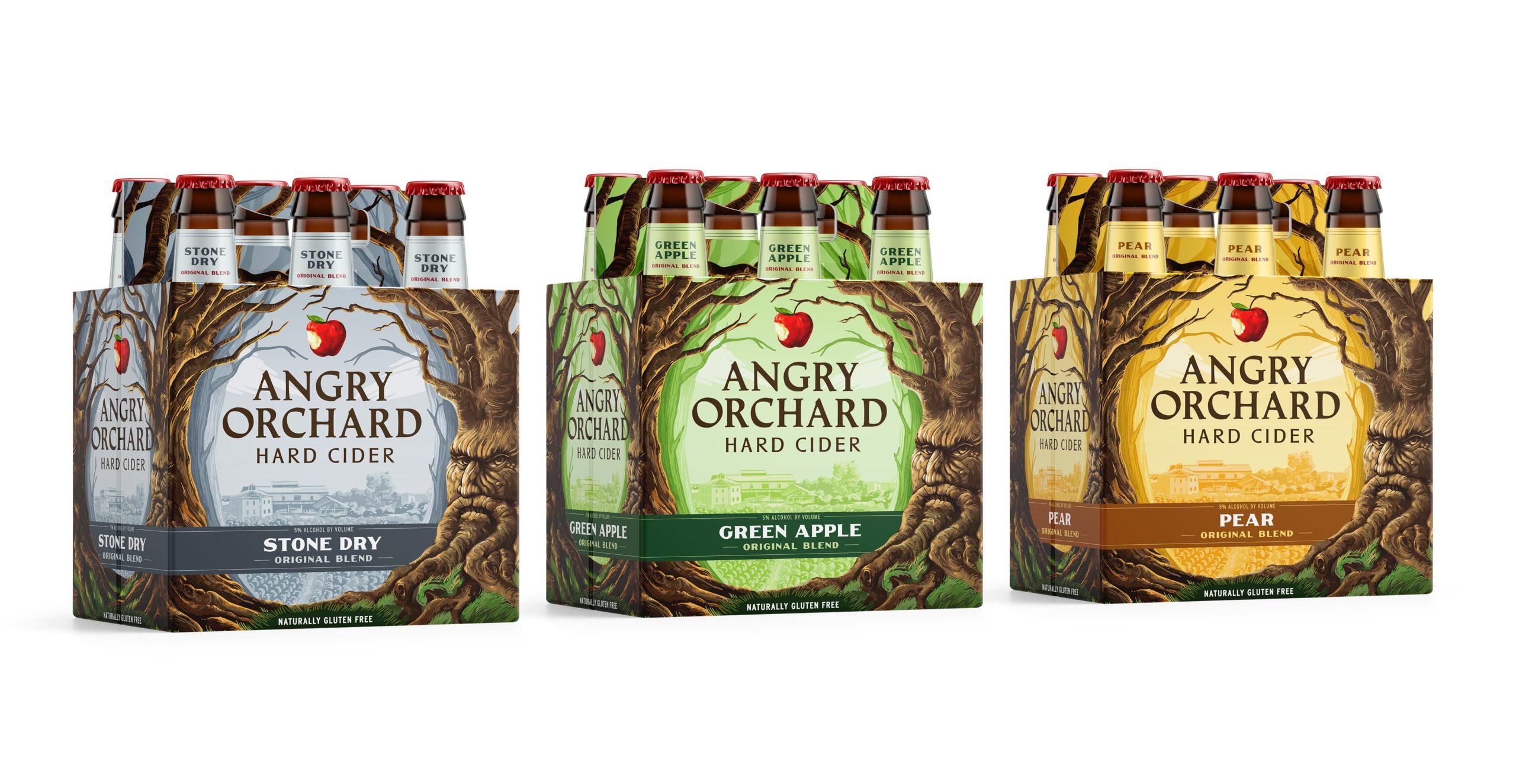
Packaging redesign for one of the biggest names in hard cider.
A new look (and no less angry).
CLIENT
When Angry Orchard launched nationwide in 2012, there was practically no market for hard cider in the United States. The category took off almost immediately, with Angry Orchard leading the charge, and today the brand is one of the best known (and best loved) in the space.
SOLUTION
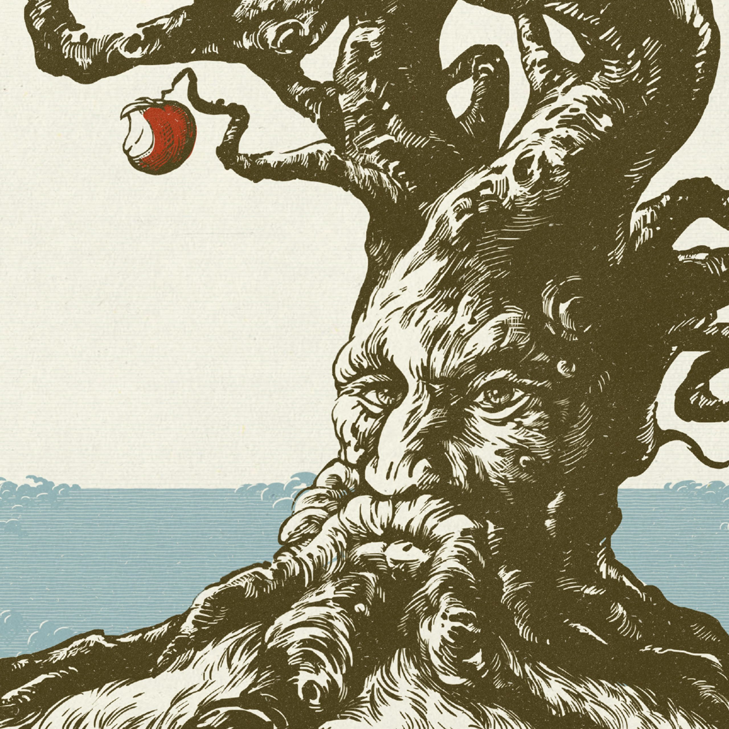
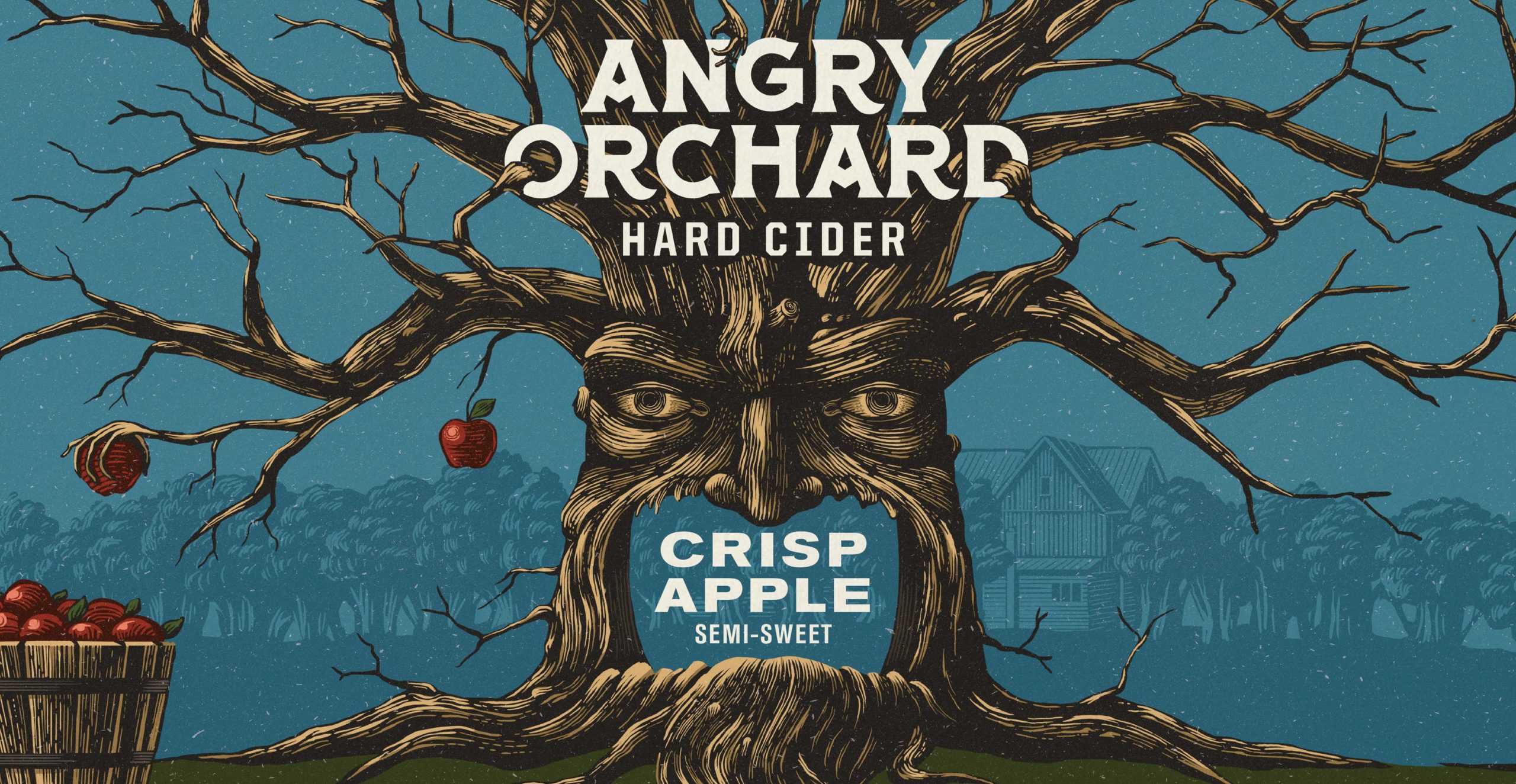
The evolved Angry Orchard packaging retains the tree and orchard environment in which the brand has built equity over the years, while updating the illustration style to be more modern, sophisticated, and premium. A new logomark further helped with brand storytelling, communicating both the brand’s premium and its craft origin.
Additionally, the new design system drastically improved shoppability, allowing consumers to better understand what to expect from each of the brand’s various SKUs.
.jpg?width=800&height=800&name=moxie-sozo-Angry-Orchard-Square-09-scaled-(1).jpg)