%20(2).png)
NadaMoo! Brand Strategy
Brand strategy and packaging design for a pioneer in the non-dairy frozen dessert category.
What’s cooler than being cool?
CLIENT
NadaMoo! pioneered the non-dairy frozen dessert category. The brand started making small batches of coconut milk “ice cream” in Austin, Texas, in 2004. Since then, NadaMoo! has become one of the best known names in the frozen aisle, making a better-tasting, higher quality dairy-free experience a reality.
CHALLENGE
When NadaMoo! launched in 2004, the brand was one of just a handful of brands on the non-dairy shelf. Today, that shelf is brimming with non-dairy options—not just coconut, but almond, soy, macadamia, and beyond. To stand out against their new flood of trend-chasing competitors, NadaMoo needed a new look to recapture the attention of consumers frequenting the aisle—and those visiting it for the first time.
SOLUTION
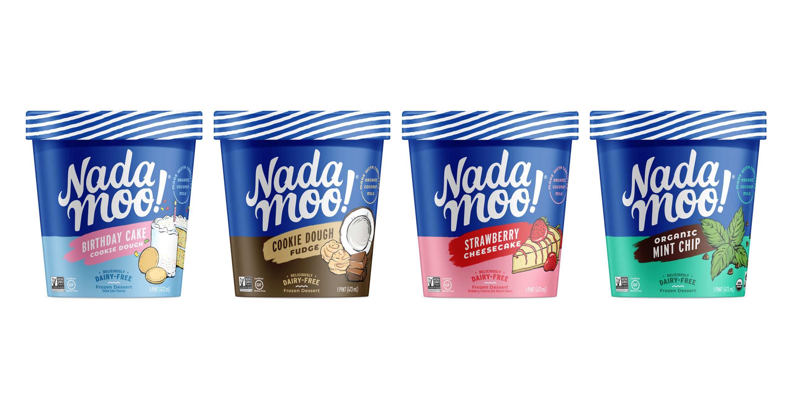
Category and consumer research uncovered an opportunity to connect the dots between what consumers want and the qualities on which NadaMoo! has built its reputation: great taste and creamy texture.
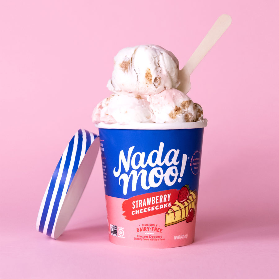
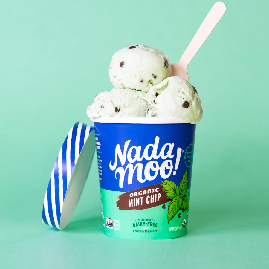
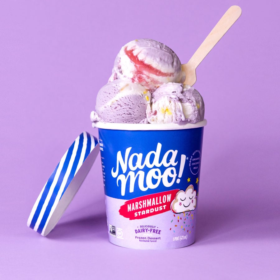
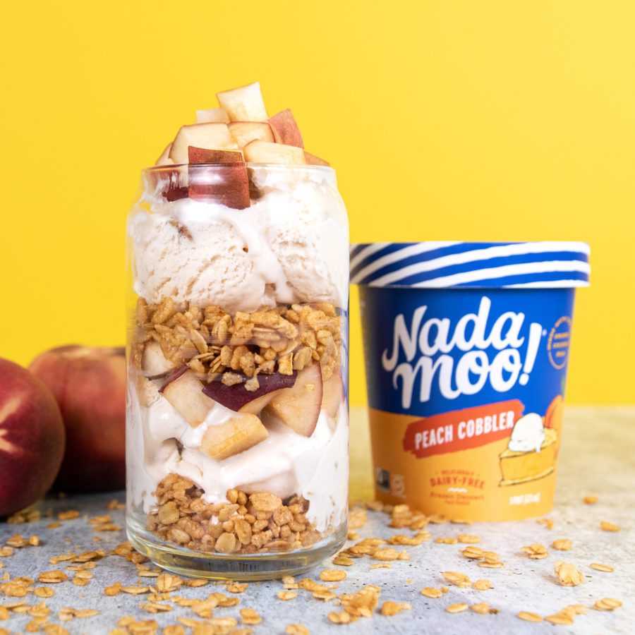
Armed with those insights, we evolved the brand’s existing look. The updated packaging retains many of the elements consumers have come to recognize (and adore) while further elevating the brand’s playful personality and taste appeal. The new design improves the hierarchy of information, and with the addition of a consistent blue band across every SKU, creates a strong brand block on-shelf, making it easy for consumers to find NadaMoo! and quickly find their favorite flavors.
And because sustainability and responsible sourcing have been at the heart of the brand since NadaMoo! began, the new packaging features a plant-based lining in place of the non-recyclable lining most producers use, making the pint much more environmentally friendly.