Suja Juice Brand Strategy
Brand Strategy and packaging design for one of the originals in cold-pressed juice.
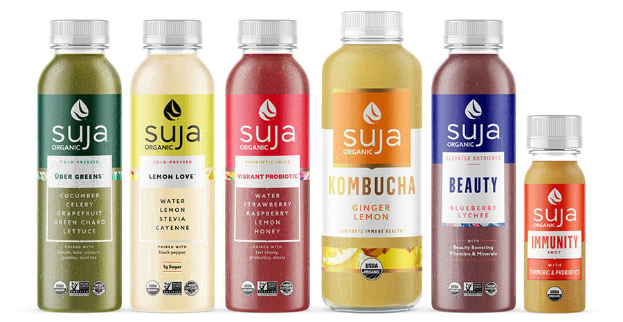
Grab life by the lemons.
CLIENT
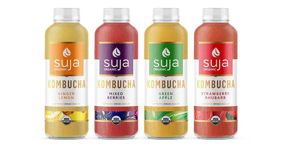
Founded in 2012 in sunny San Diego, Suja helped to create the ready-to-drink cold-pressed juice category with a small home-delivery business. Today, Suja is the leading brand in cold-pressed juice and a strong footing on adjacent shelves, including wellness shots, kombucha, sparkling probiotics, and more.
CHALLENGE
With the rise in popularity of healthier lifestyles and brands focused on wellness, the cold-pressed juice category grew, too. Many of those brands took cues from the category leader—Suja—for their packaging design and brand aesthetic. As a result, Suja found itself sitting alongside brands who looked and talked like they did but couldn’t compete on taste or quality.
To reassert and cement its place as the category leader, Suja needed a new look and rallying cry that clearly articulated its differentiation in a way that appealed to a new mainstream audience without alienating their loyal and passionate core.
SOLUTION
Suja is a way of being.
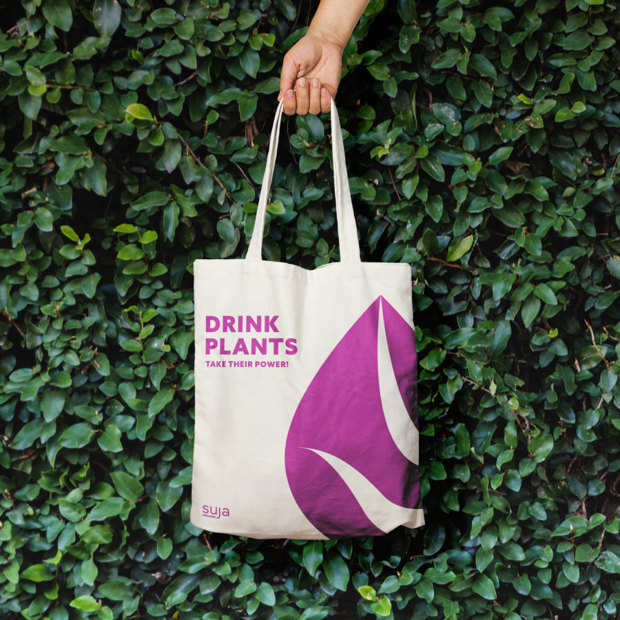
The project began with an in-depth look at the Suja brand, its consumers, and the rapidly evolving category. Through that process, we came to a realization: more than a brand; Suja is a way of being. That realization birthed a rallying cry for consumers new and old: Make nutrition your bliss.
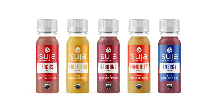
To bring the brand to life on-pack, Suja needed a look that utilized what works for the brand while creating better consistency and justifying its premium price point on-shelf.
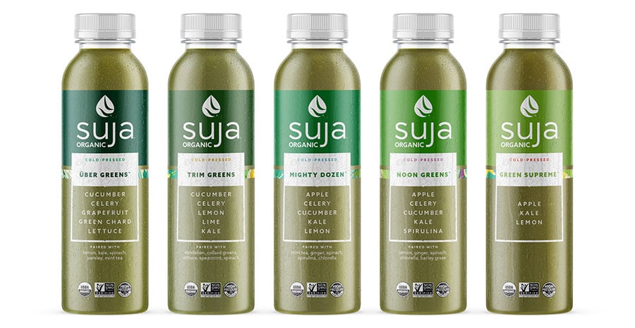
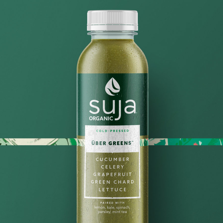
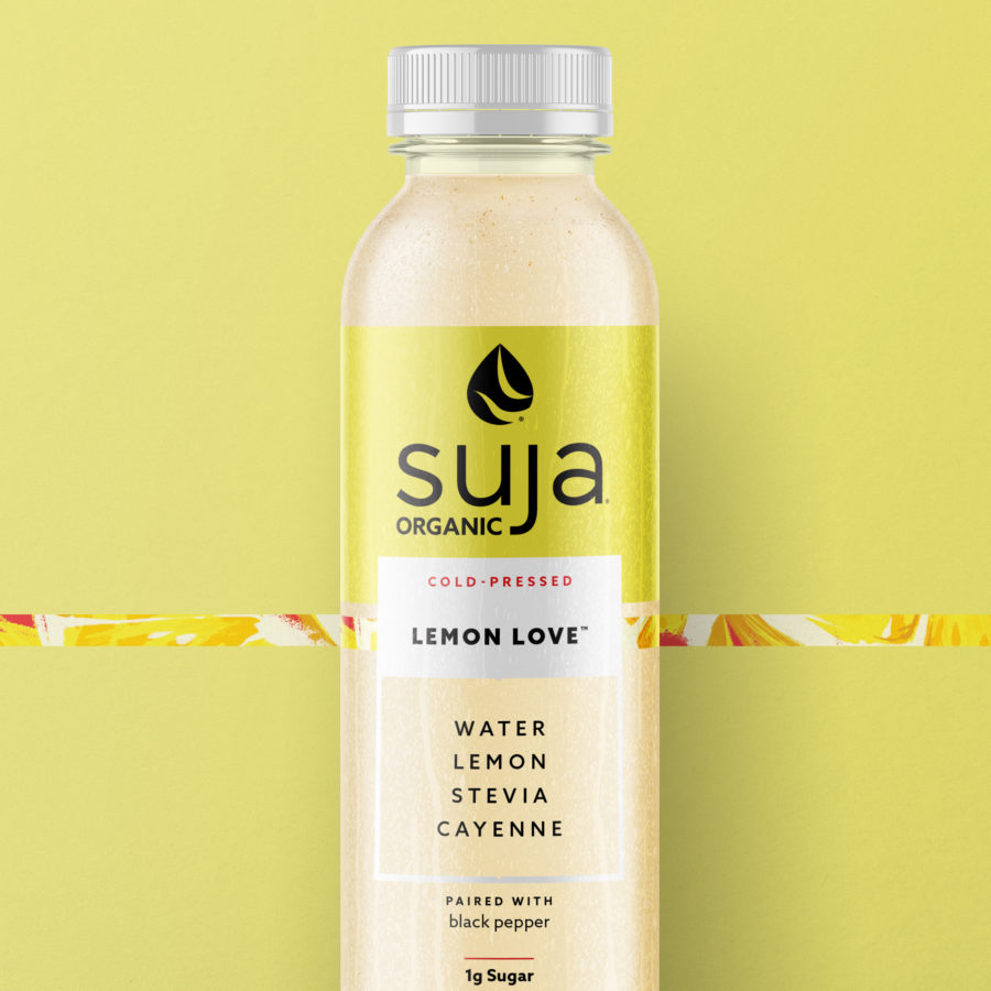
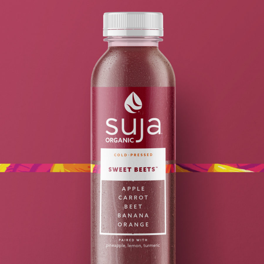
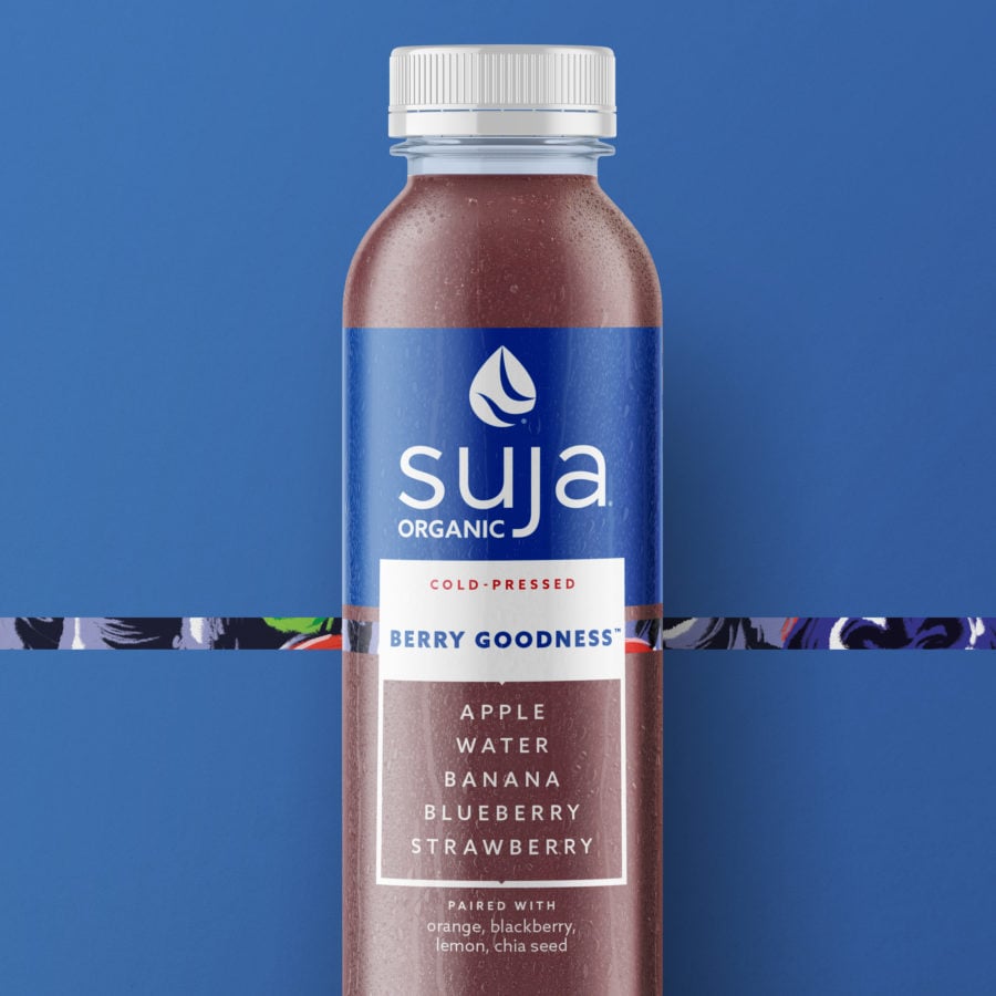
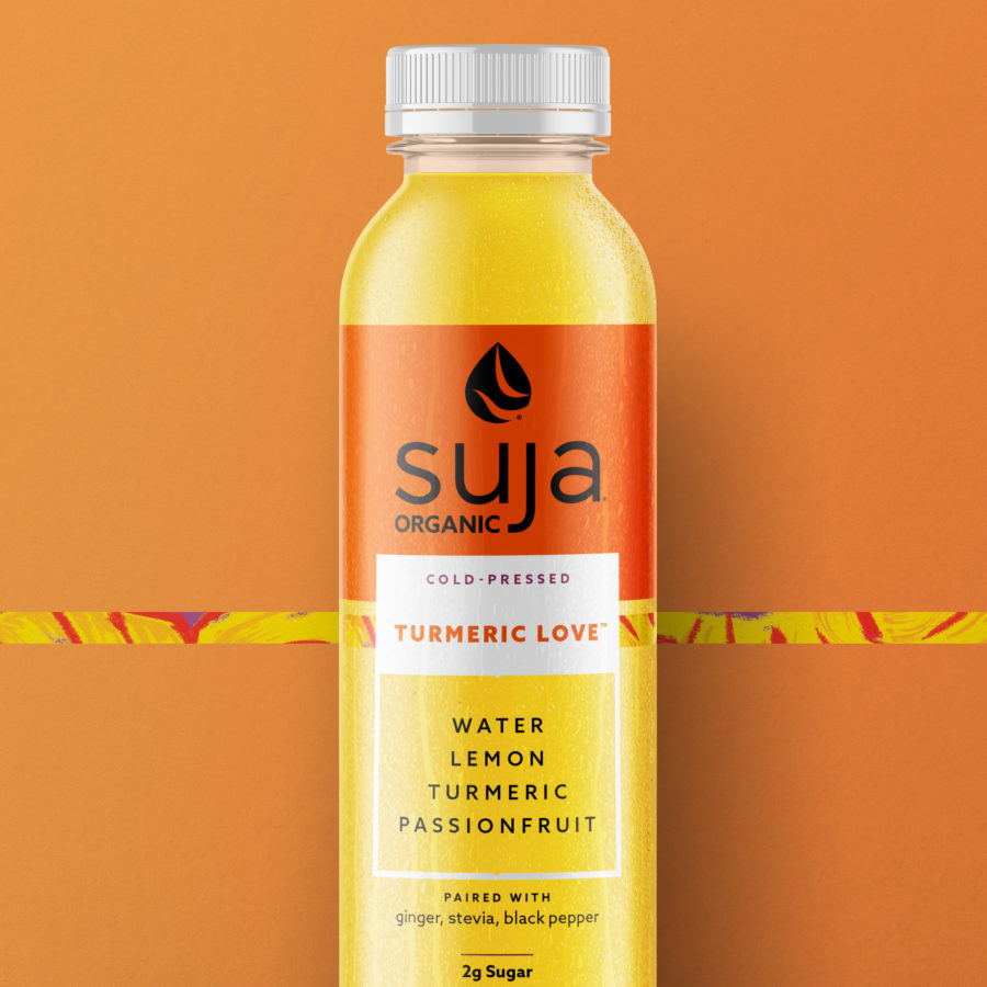
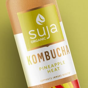
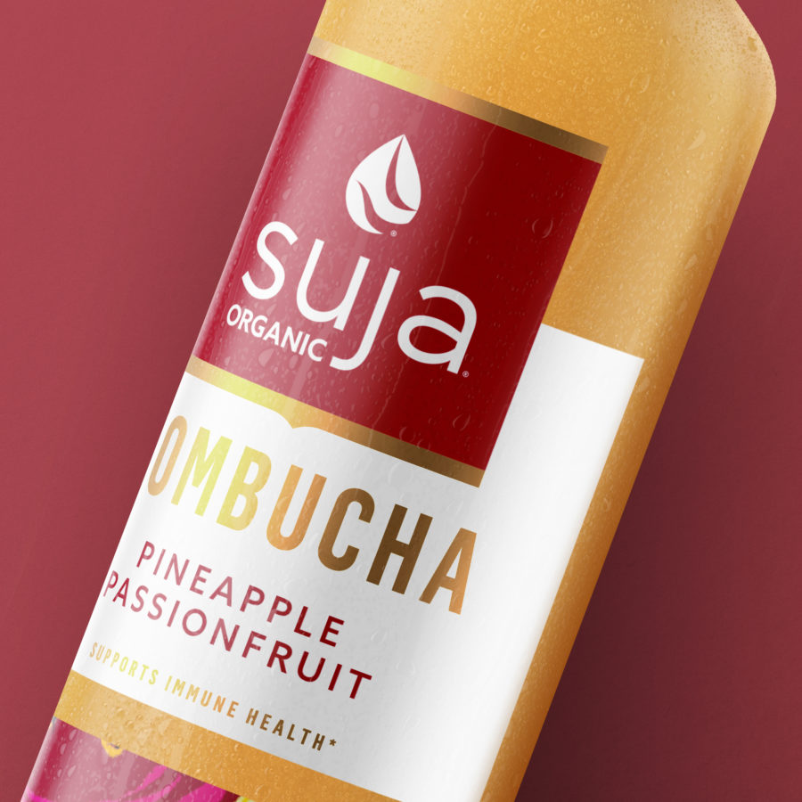
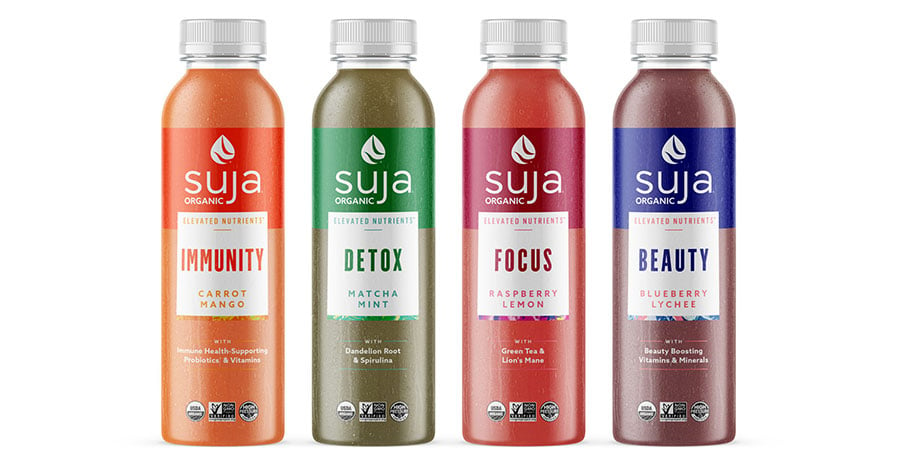
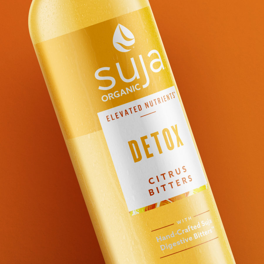
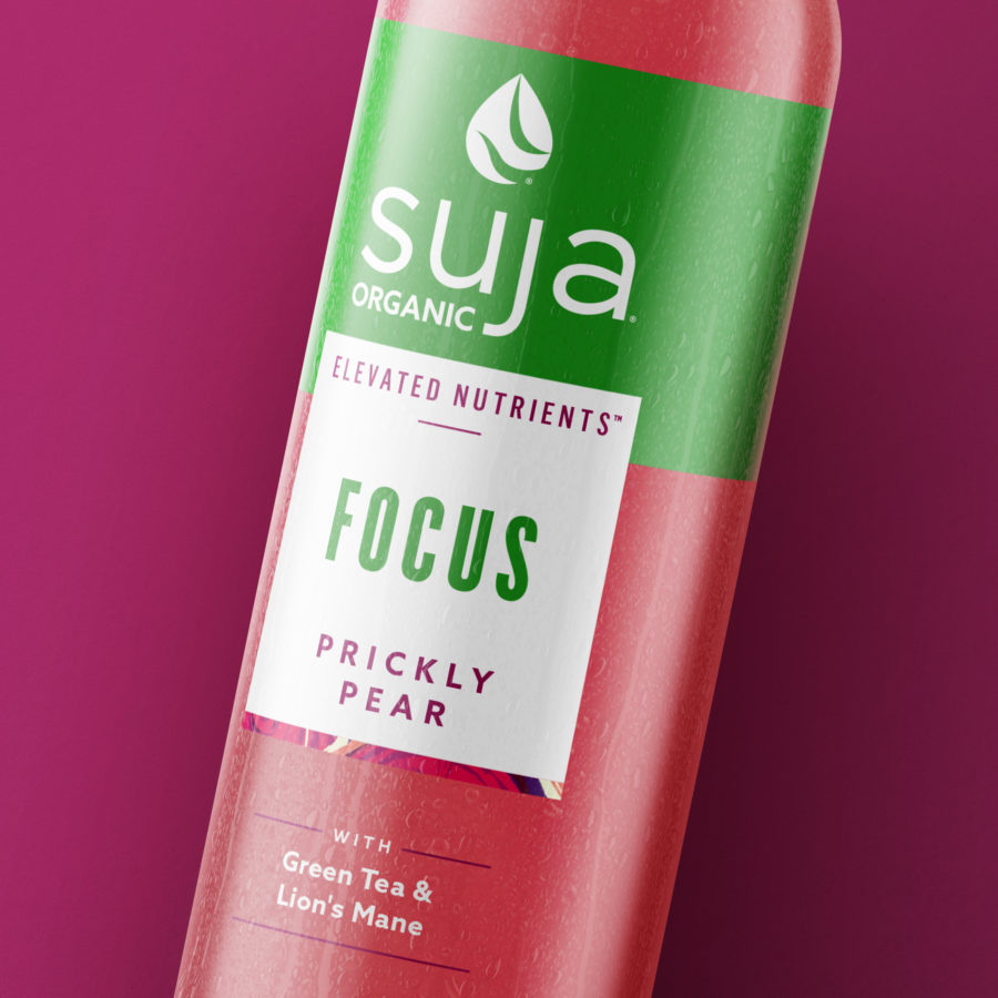
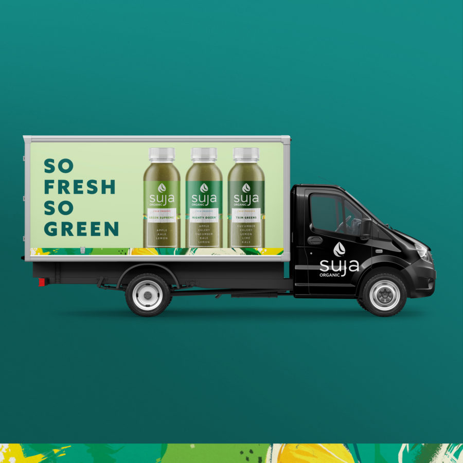
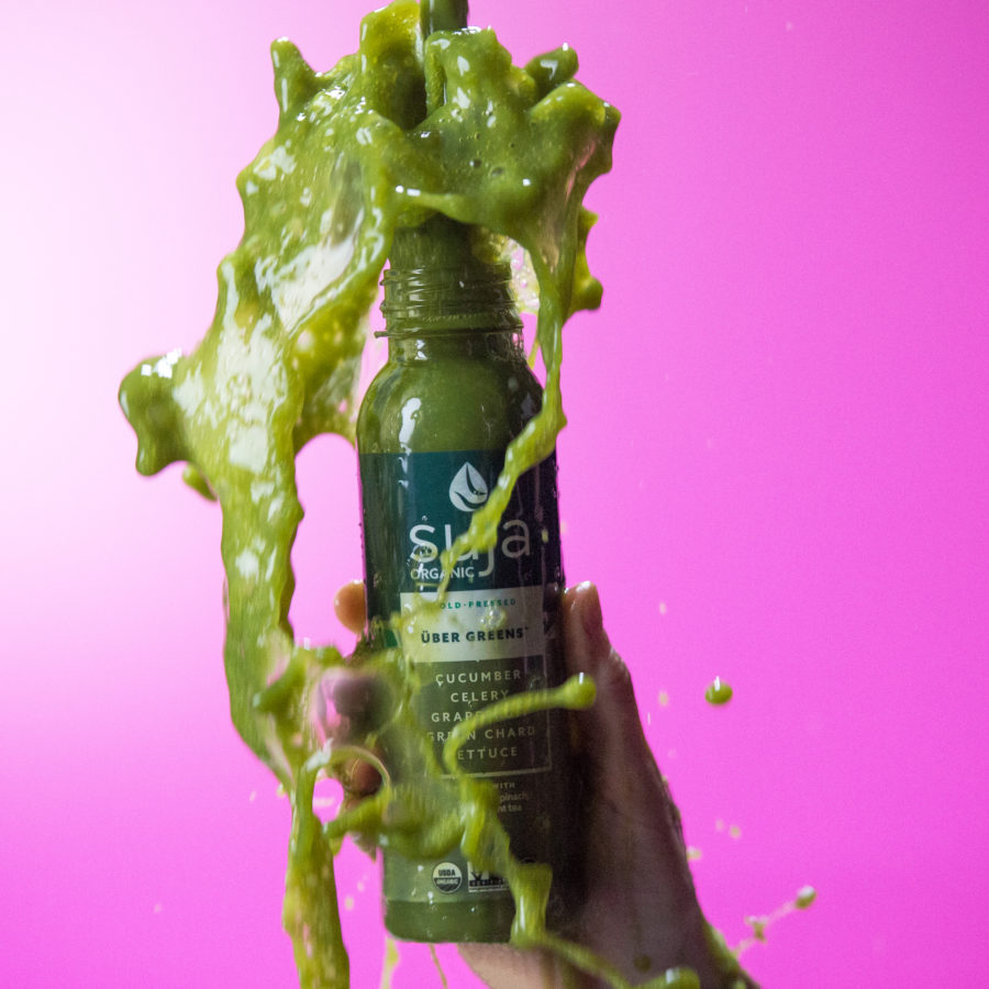
The new design system evolved the “word cloud” that had been a staple of the brand. It was replaced with a simple window, which clearly highlights the most important ingredients and simplifies the hierarchy while also reinforcing our philosophy of transparency—you can literally see what’s inside.
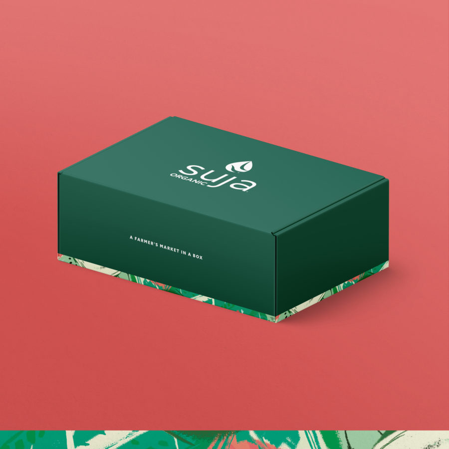
Additionally, the packaging needed to communicate the brand’s personality and quality ingredients, but in a more tasteful way. The new “art strip” showcases the ingredients featured in each bottle abstractly, giving a hint of the brand’s personality in a way that doesn’t overpower everything else happening on-pack.
Together, these elements create a consistent look and feel that commands a premium position in the market. Perhaps most importantly, the newly evolved brand positioned Suja for further growth—in its current categories, and beyond.

%20(2).png)