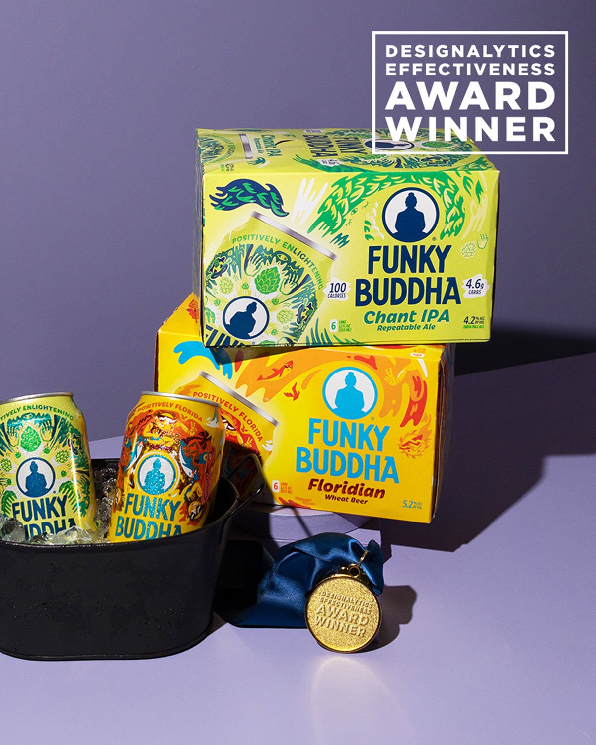
If you’ve ever noticed your brand colors looking one way on a computer screen, another way on packaging, and slightly different again in stores, you’re not imagining it. Color really does change depending on where it lives. Even brands with world-class brand systems like Coca-Cola experience this. In fact, a small study found that most people couldn’t even pick “
Coca-Cola Red” out of a lineup of similar shades, suggesting that even iconic colors aren’t as fixed or memorable as we think.
There are many reasons why colors appear to “change,” and here’s the reassuring truth: perfect color consistency across every platform is not only unrealistic, but perhaps completely irrelevant. More importantly, it doesn’t stop your brand from being instantly recognizable.
Why Color Changes
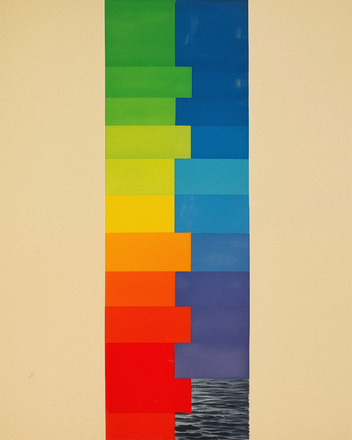
Color isn’t a single universal value — it’s the result of many variables working together. Even when every vendor follows the right specs, files are perfectly built, and the press is running flawlessly, color will still look different from screen to print, print to packaging, and even packaging to packaging. The differences start with how we’re receiving that color.
On Screen: Our screens work by producing color from light—specifically red, green, and blue (
RGB) shining from tiny subpixels. Because the image is illuminated from behind, colors appear bright, saturated, and consistent … but only when the screen itself is calibrated.
In Print: Print works in the opposite way. It uses
CMYK inks (process colors) or spot colors (pre-mixed inks like Pantones) laid onto a physical substrate. The color you see comes from reflected light rather than emitted light, which naturally makes printed colors softer, warmer, or more muted. This is why a vibrant digital blue often looks deeper or darker in print, even when printed perfectly.
Materials: The substrate adds another layer of change. Kraft paper warms and absorbs color, glossy finishes make it pop, and films, foils, and aluminum all shift appearance based on how they reflect or diffuse light.
Lighting: And finally, ambient lighting changes everything. A perfectly matched sample can look cool in daylight, warm under office LEDs, and noticeably different under retail fluorescents — without anything being technically wrong.
We Don’t See Color the Same Way, Either
Humans don’t universally perceive color the same way. Psychology Today explains how
differences in the retina and brain mean two people can look at the same color and see slightly different hues. Research published in the PMC adds that
variations in cone cells — photoreceptors responsible for color vision — cause measurable differences in how individuals interpret reds, greens, and blues.
Cultural and cognitive factors play a role as well, as DataColor highlights how people describe and categorize colors differently depending on language and background.
All of this helps explain why colors are interpreted differently from person to person — and why your brand color will be, too.
So What Does Real Color Consistency Look Like?
Since color will always shift, the goal isn’t to make it identical everywhere.
The real goal is controlled consistency — building a system that keeps your brand color recognizable across every touchpoint.
That includes setting clear targets, adjusting builds for different materials, accepting a reasonable tolerance range, working with excellent vendors, and aligning digital and physical outputs. In short: We don’t eliminate drift. We guide it.
Color
matters, but it’s only one part of a much larger brand ecosystem. Shape, typography, layout, tone, and structure play equally important roles in recognition. When those elements work together, the brand feels unmistakably “you.”
The Bottom Line
People perceive color differently. Materials interpret color differently. And ambient lighting shifts what we see all over again. Even so, the most iconic brand colors stay recognizable, despite the natural haze of human perception and the drift that happens across different platforms.
With the right
production partner, your brand can also feel consistent, intentional, and unmistakably yours — even as color shifts in the ways it always will.
%20(2).png)