%20(2).png)

Did you know that 85% of consumers make purchasing decisions based on color? This compelling statistic underscores the undeniable influence of color theory in beverage packaging design. Each hue has the power to evoke specific emotions, shaping consumers’ perceptions and choices. Moreover, color serves as a powerful tool for reinforcing brand identity, leaving an indelible impression on consumers’ minds.
Read on to learn about the profound impact of color psychology and why it’s a major consideration for every successful beverage advertising agency in crafting captivating packaging designs.
The Basics of Color Theory
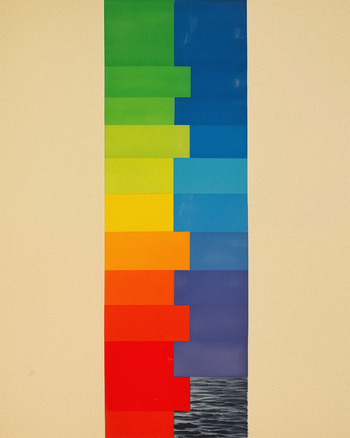
Color plays a huge role in how people perceive your drink and brand. There are three key factors to understand: hue, value, and intensity. Warm colors like red, orange, and yellow often make people feel happy and energetic, but they can also bring out feelings of anger. On the flip side, cool colors like blue, green, and purple tend to create a sense of calm, although they can sometimes feel a bit sad. Choosing the right colors for your packaging is crucial for sending the right message to consumers.
Color Harmony Made Simple
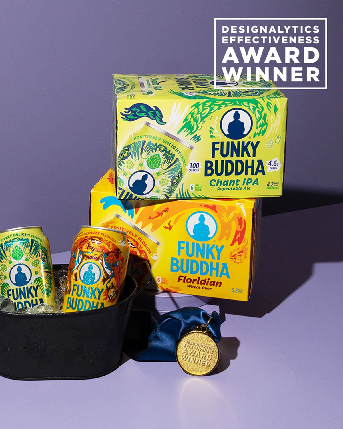
Analogous colors are basically colors that sit next to each other on the color wheel. They work well together and can create a nice gradient effect. For example, if you're selling a tangerine-flavored drink, you might want to go with shades of red, orange, and yellow to keep things cohesive and eye-catching.
Keeping It Clean with Monochromatic Designs
One of the latest trends is using just one color in different shades to keep things looking sleek and modern. This not only keeps packaging costs down but also gives off a vibe of simplicity and purity, perfect for drinks with minimal ingredients.
Popping with Complementary Colors
Complementary colors are the ones opposite each other on the color wheel. They create a striking contrast that catches the eye. Think blue and yellow or red and green. Mixing and matching these colors can give your brand a unique look and feel.
Matching Color to Mood: How Beverage Packaging Speaks Volumes
When it comes to beverage packaging, the colors you choose can speak volumes about the type of drink you're selling. Each color carries its own set of emotions and associations, making it essential to align your packaging with the mood you want to evoke in consumers. Let's explore how different colors can shape perceptions:
- Red: Bold and vibrant, red is often associated with energy and excitement. It's an ideal choice for beverages that aim to ignite passion and enthusiasm, such as fiery energy drinks or bold fruit-flavored concoctions.
- Orange: Radiating warmth and vitality, orange exudes confidence and joy. Beverages boasting vibrant orange hues are likely to convey a sense of fun and playfulness, perfect for refreshing citrus blends or zesty summer drinks.
- Yellow: Symbolizing sunshine and positivity, yellow brings clarity and optimism to the forefront. Beverages adorned in sunny yellow packaging evoke feelings of freshness and vitality, making them an excellent choice for invigorating citrus juices or revitalizing energy drinks.
- Green: Reflecting the lushness of nature, green embodies growth, health, and vitality. Beverages housed in green packaging exude a sense of freshness and wholesomeness, making them an appealing choice for natural juices, herbal teas, or organic health drinks.
- Blue: Evoking a sense of tranquility and serenity, blue exudes calmness and depth. Beverages presented in soothing blue packaging are often associated with relaxation and hydration, making them an excellent fit for calming herbal teas or refreshing mineral waters.
- Purple: Rich and luxurious, purple conveys a sense of opulence and sophistication. Beverages wrapped in regal purple packaging evoke feelings of indulgence and exclusivity, making them a natural choice for premium wines, grape juices, or antioxidant-rich superfood blends.
- Pink: Soft and delicate, pink radiates femininity and elegance. Beverages adorned in blush pink packaging evoke a sense of beauty and grace, making them an ideal option for delicate floral teas or artisanal rose-infused drinks.
- Brown: Earthy and grounded, brown exudes a sense of warmth and naturalness. Beverages presented in rustic brown packaging evoke feelings of authenticity and wholesomeness, making them a fitting choice for artisanal coffee blends or rich chocolate-infused drinks.
By considering the emotions and associations tied to each color, beverage companies can strategically leverage packaging design to align with the intended mood and message of their product, ultimately captivating consumers and fostering brand loyalty.
Color serves as a cornerstone in conveying your brand's essence to consumers, so don't shy away from getting creative with your beverage shelf design. Remember: Consumers form impressions within seconds of encountering a product, underscoring the importance of making a captivating initial impact.
For help with creative beverage shelf design, turn to Moxie Sozo. We can help you distinguish your brand in this highly competitive market with the right packaging and brand identity.

Related Traps