Thirsty consumers want to buy from a company that not only satisfies their taste buds but also “gets them” on a personal level. This starts with the beverage label design. It's not just a piece of packaging; it's a canvas for connection, a portal into your brand’s ethos.
So, what makes a great beverage label? Since it’s going to contribute to your brand identity, the overall design should be timeless. Because consumers can be fickle, though, it’s also worth considering current trends. Merging timeless with trendy is undoubtedly a challenge, but it’s not impossible. If you start with your name and logo and find a way to adopt one or more of the following, you’re well on your way to creating a beverage label design that’s sure to fly off the shelves.
Trend #1: Eye-Catching Cartoons
Fun, youthful designs have been making waves in the beverage industry lately, especially on beer cans in particular. The right colors and cartoons can lift people’s spirits and arouse interest, and it’s this sense of optimism that will convert curious consumers into devoted customers.
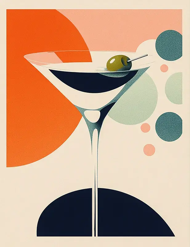
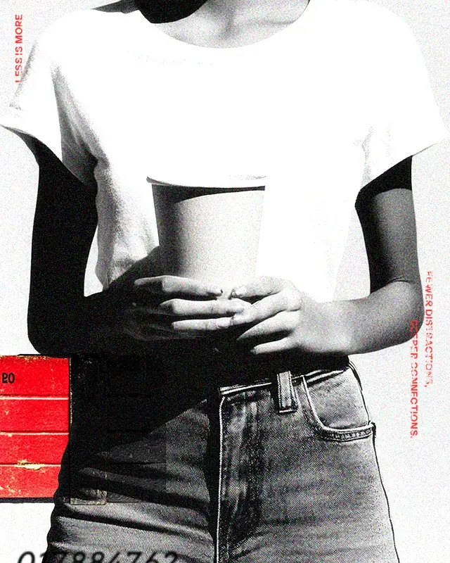
Trend #2: Minimal Graphics
Of course, as popular as cartoons are right now, we’ve also seen designs trending in the opposite direction. Some brands prefer a more subdued, sophisticated look and will opt for a label that avoids flashiness in lieu of a minimalist design. The simplicity promotes transparency and trust, which is essential for brands that are more respectful and straightforward than fun and playful.
Trend #3: Hand-Drawn Illustrations
Nowadays, consumers are flocking to designs that look like pieces of art rather than mere manufactured labels. When a hand-drawn illustration is on every bottle, can, or carton, the consumer feels like it was made specifically for them. This also appeals to those with artistic sensibilities, as they appreciate admiring the artwork while they sip.
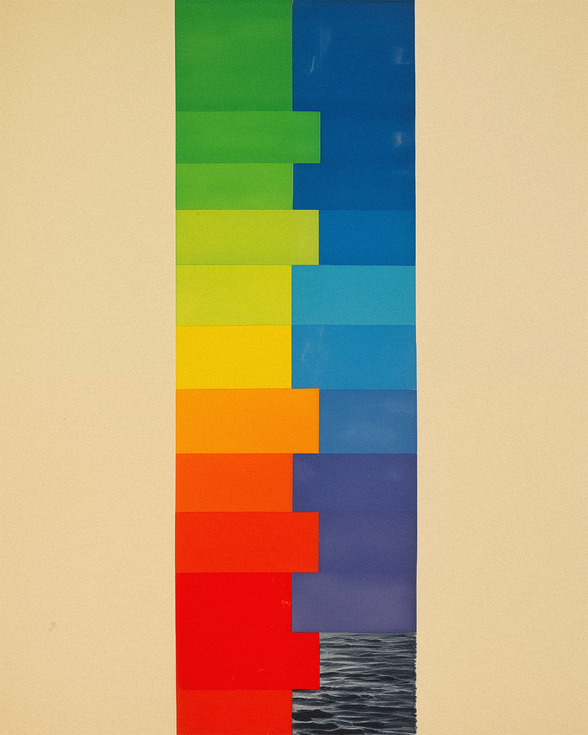
Trend #4: Strong Color Contrasts
Color contrast is essential for most designs to work effectively, but this concept can be taken to a new level. The bolder the contrast, the more attention it will garner. Consider the blue and yellow beverage label design for Funky Buddha. Incorporating colors on opposite ends of the color wheel is one of the easiest ways to draw the eye.
Trend #5: Bold Typography
Bold fonts work with just about any design and have been becoming increasingly popular in 2024. Design can communicate a lot about a brand, but the messaging of your beverage label is equally essential. Bold font enables clear communication, making your messaging abundantly clear about who your beverage is designed for.
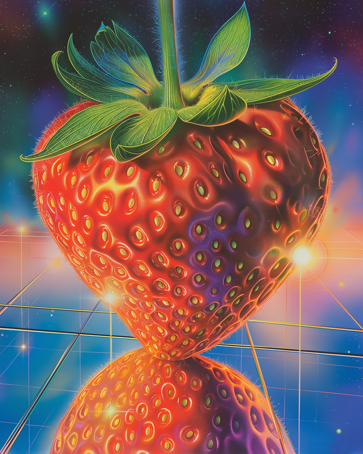
Trend #6: Psychedelic Designs
A kaleidoscope of colors on a single beer can takes consumers back to the ’60s when psychedelic trends took root. A revival of psychedelic designs has made its way into the market in recent years, and it appears to be growing in popularity as the year goes on.
Trend #7: Storytelling
This one isn’t a “design” per se, but our list wouldn’t be complete without mentioning the importance of storytelling. Consumers are becoming more discerning with every passing year, and they want to know where their beverages come from and why they should keep buying them. By incorporating a narrative into your label design, you connect with the customer and ultimately enhance the drinking experience.
Let Us Help You Create a Trendy but Timeless Beverage Label Design!
At Moxie Sozo, we’ll bring the imagination if you bring the taste. As an independent branding and design agency focused on the CPG industry, we know what it takes to build a loyal customer base. Get in touch to learn how we can distinguish your brand in a crowded market.